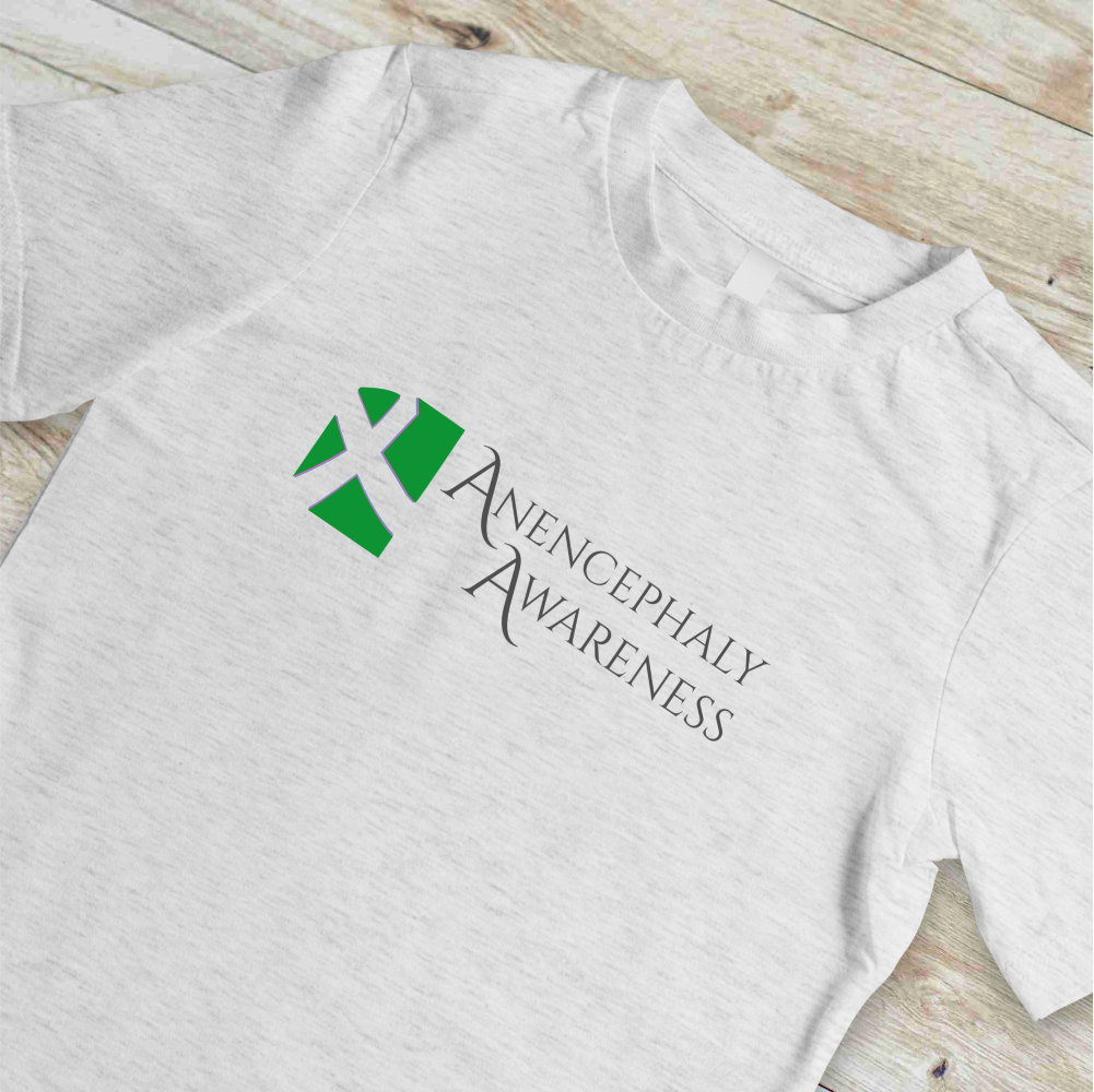
Anencephaly Awareness Logo
I am a sucker for good use of negative space. Among my personal fav logos that incorporate this is the FedEx logo and if you know, you now. When a friend reached out to ask for help designing a simple logo for a charity event, it offered me a change to play with negative space. This logo employs that negative space to form a ribbon symbol within layered green, pink, and blue shapes. The typography provides a dignified counterbalance to the abstract graphic element, while the green color connects to established awareness symbolism. The design demonstrates how meaningful communication can be achieved through subtle techniques that reward viewers who take a moment to perceive the complete message. In art, there’s not much better than a design that makes you look at it for a minute.


